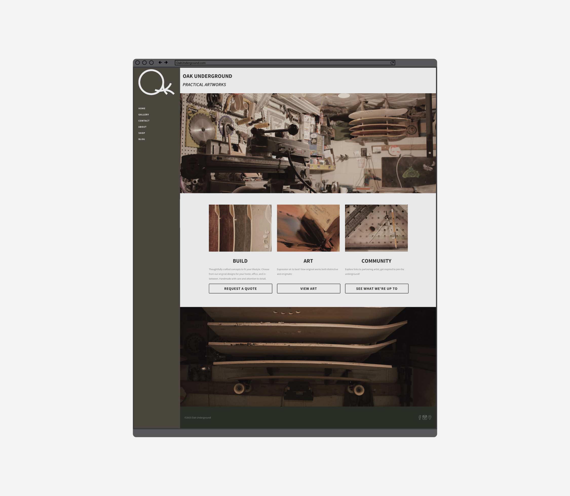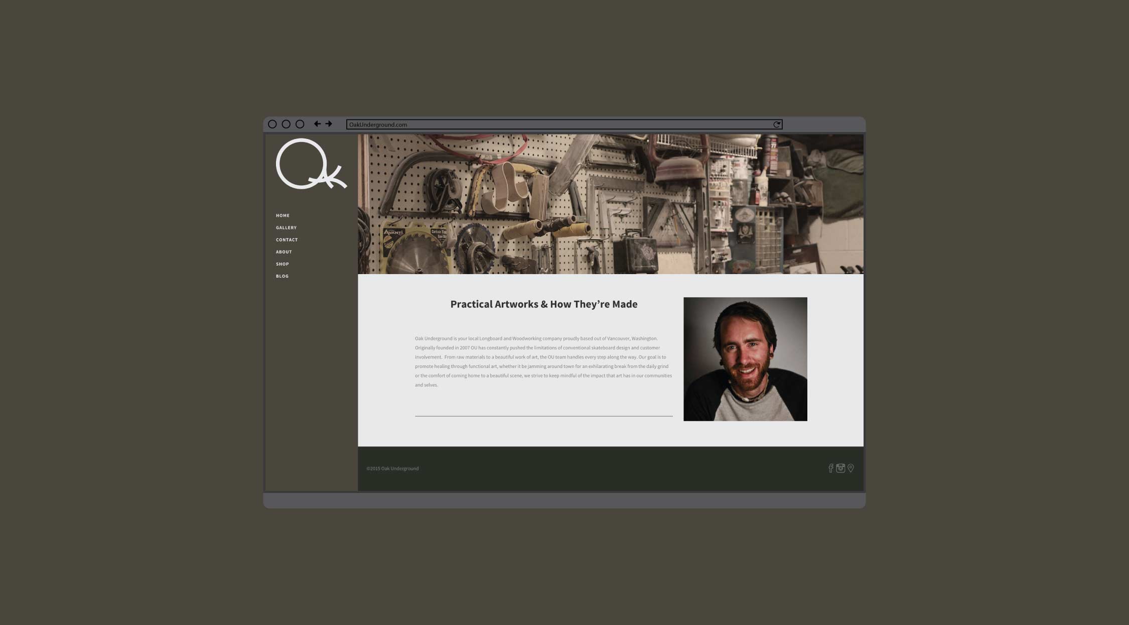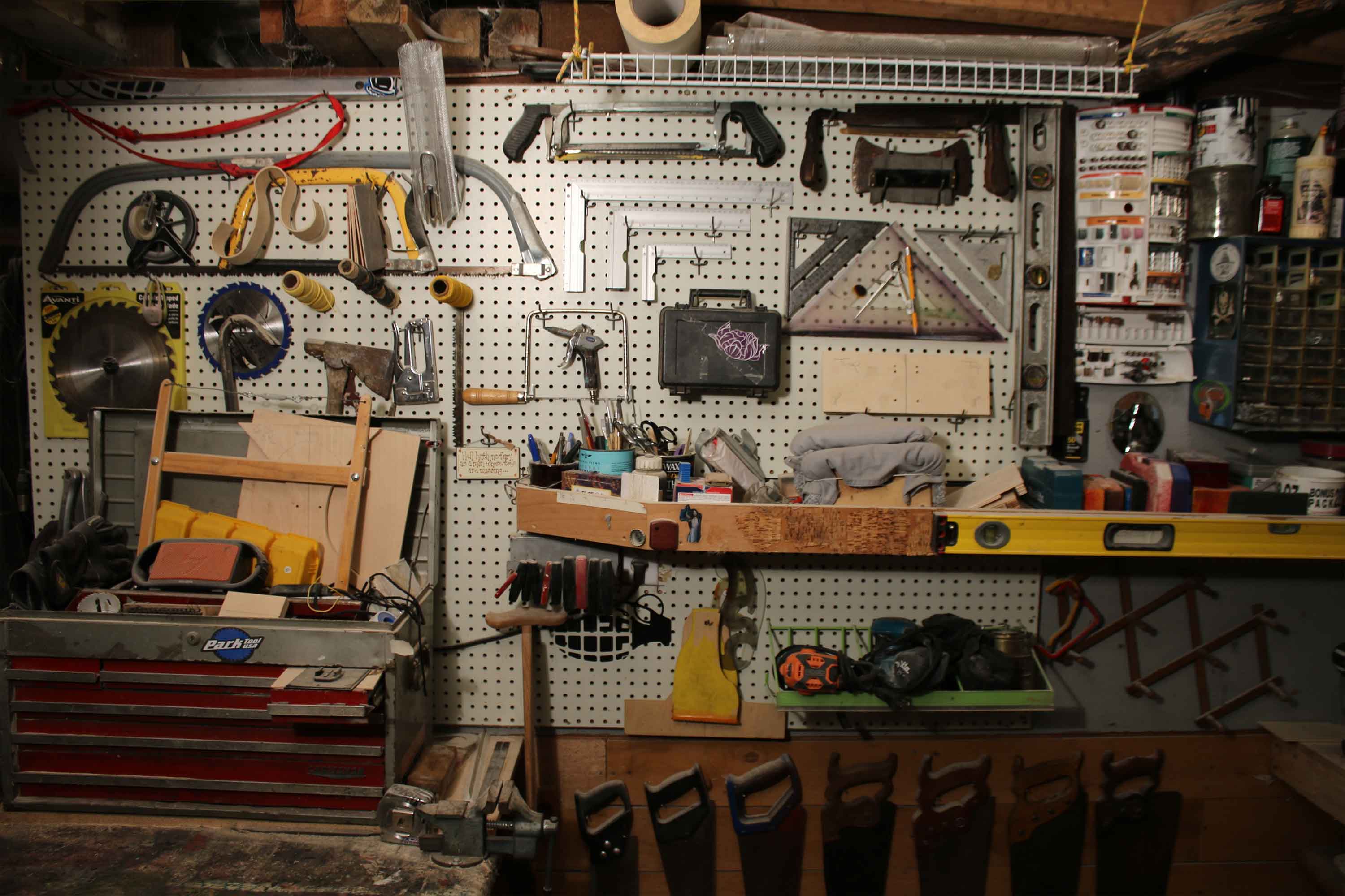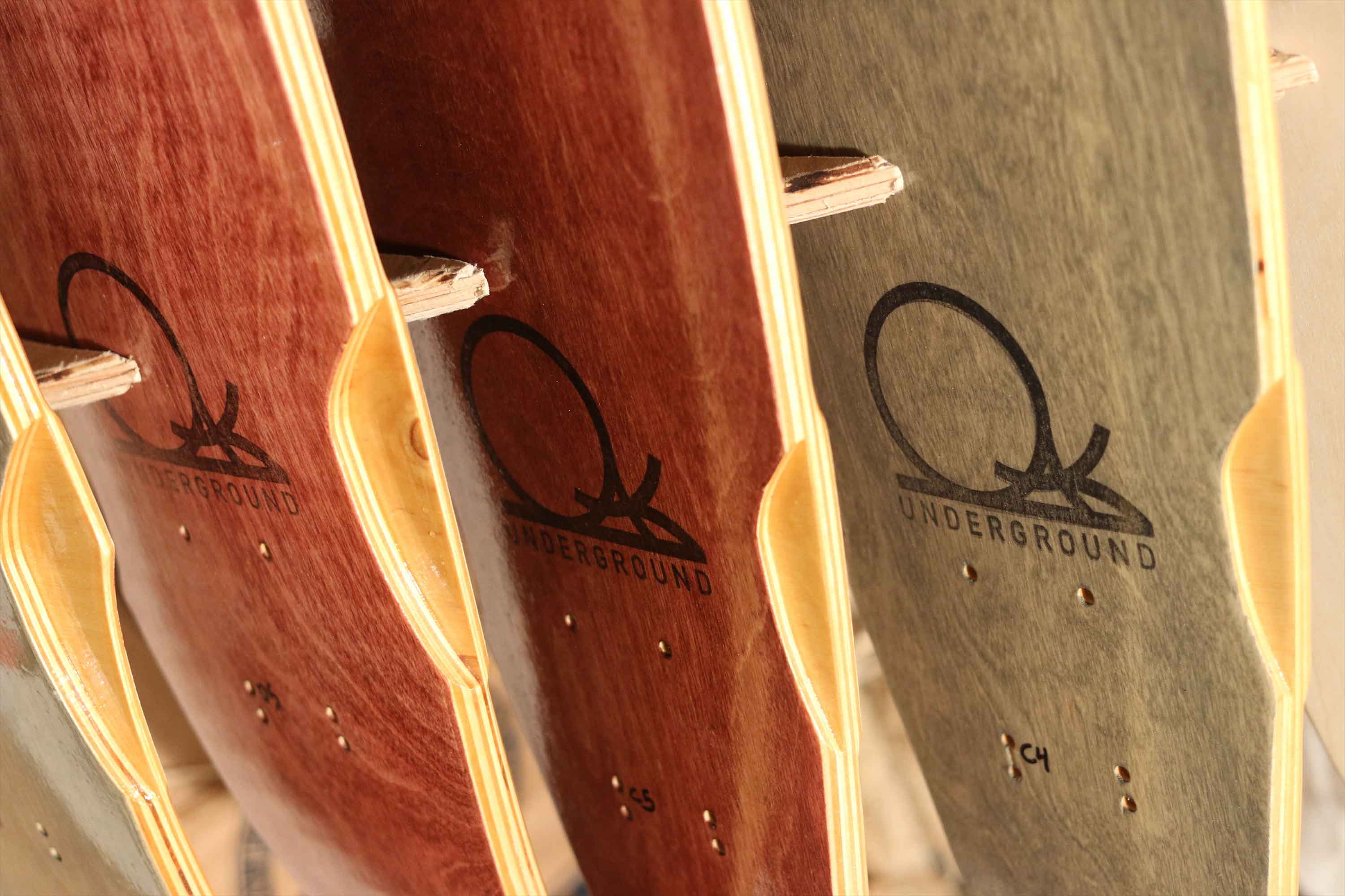
Like most works of passion, Oak Underground started out as a project filled with dreams. Kevin had been skating and longboarding for years, which meshed well with his love of working with his hands. In high school Kevin started making Longboards and exploring the process. Their early boards were rugged yet simple. As Kevin focused more and more on the board creation, he expanded his processes and acquired all the proper tools required for the job. At the same time, Kevin’s life was a whirlwind of community and activity. After a long period of evaluation, Kevin decided to make the hobby official, and opened Oak Underground, which is named after the strong underground structure of Oak roots.
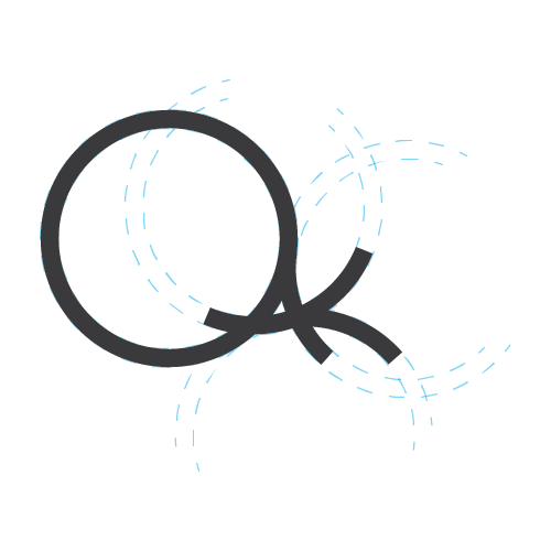
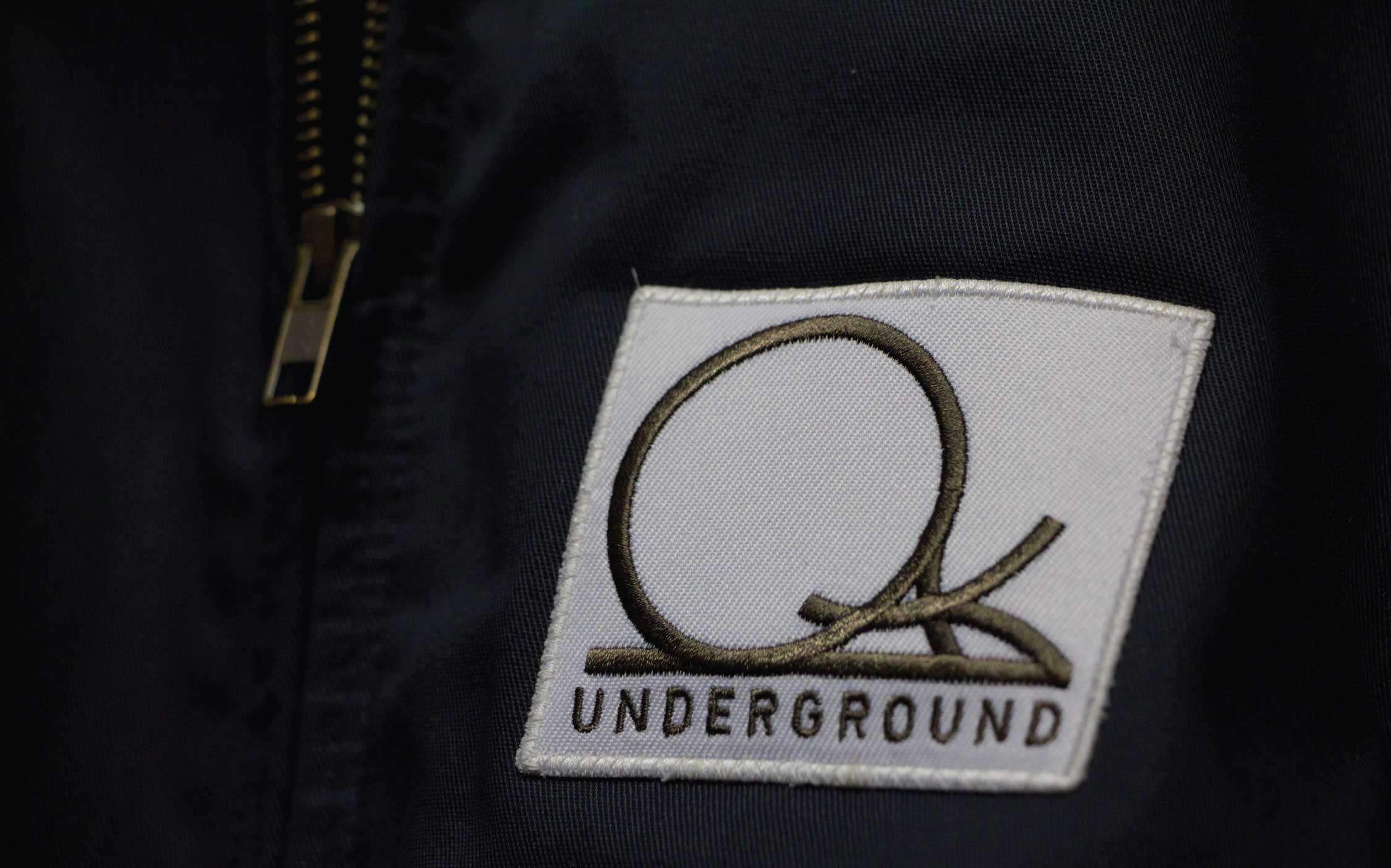
Overall, our goal for this project was to create a look and feel for Oak Underground that would represent Kevin’s mission (of longboards + community) effectively and directly.Kevin’s hope was to have a very clean image that would be quick for people to understand and digest. We also wanted to stick close to something that felt natural and organic, which grew out of conversations with kevin about his brand, as well as his lifestyle and view of the world. The main challenge these goals created for use was how to properly connected organic community and a clean, organized business. Our course was set to find the overlap between these ideas and bring them to life. Our first plan of action was to establish what the overall look would be. Working off of our initial mood boards, we were able to layout the color palette right away. The gray and green set the stage for the brand, giving the feeling of a moss covered forest. Moving on to the logo design, we worked with quite a few options involving custom hand lettering, root systems, circles & inclusive shapes, tree imagery, and tool imagery. Eventually we boiled all these ideas down to focusing on the circle, which was worked into the word OAK. The circle is a stand in for how a community overlaps, combines, and branches out to form other circles.
