The Cascade Forest Conservancy is dedicated to protecting and sustaining forests, streams, wildlife, and communities in the heart of the cascades through conservation, education, and advocacy. The cascade mountain range is a defining feature of the beautiful PNW, providing the scenic backdrop to countless instagram shots. Beyond just looking nice, the cascades also bring life and balance to the region, providing a space for people and animals alike to hide away from the cities and highways. The thick forests provide shade and shelter to many, and the open plains allow for easy grazing. Over time, these spaces can become worn down by over use, littering, harsh weather, and more. The Cascade Forest Conservancy has made it their mission to be to stewards of areas like the Gifford Pinchot National Forest. They lead volunteer teams out into the wild to restore streams and forests, as well as guiding field trips on educational journeys.
SLTFNDRY provided branding & consultation services.


Back Story
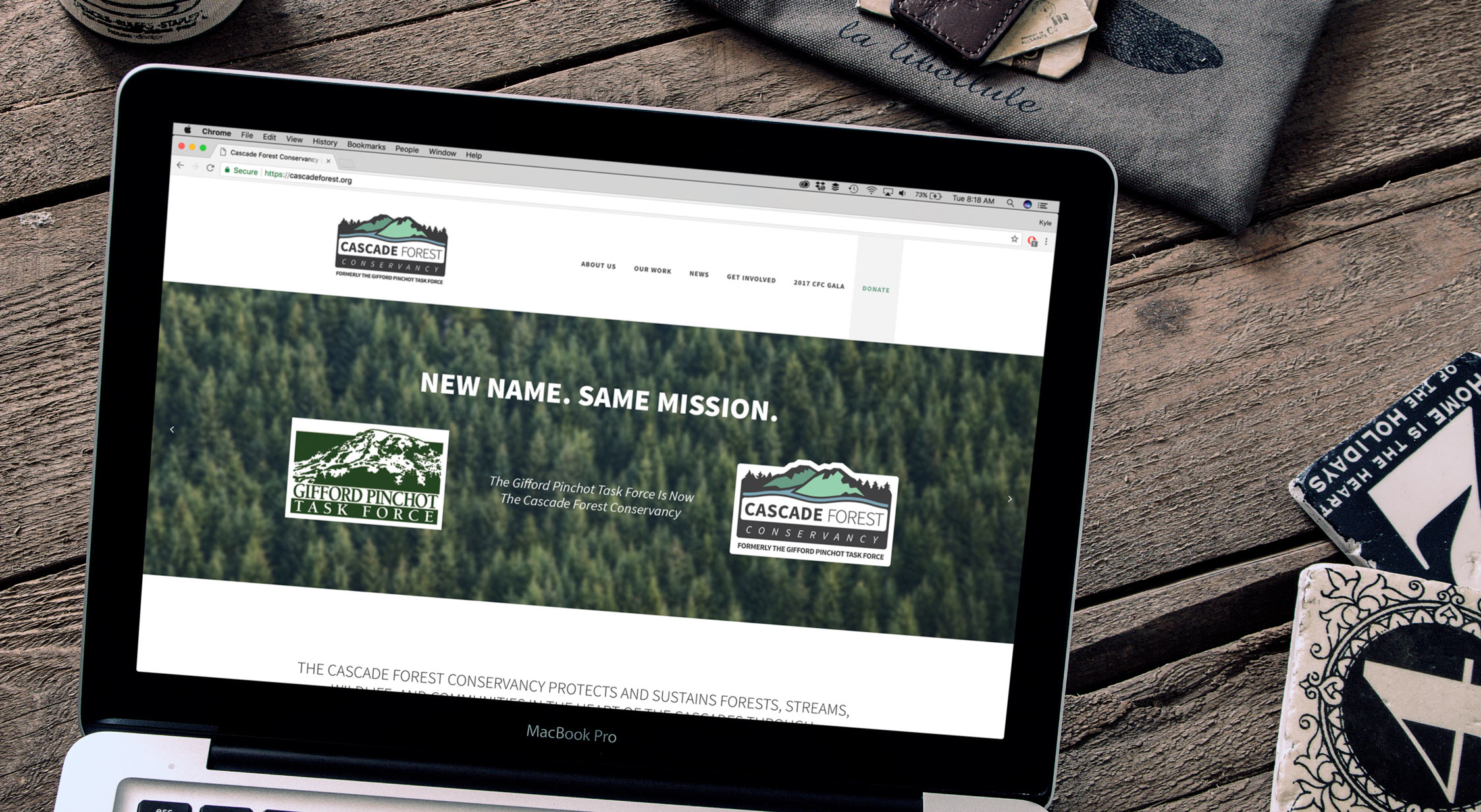
The group now known as the Cascade Forest Conservancy once focused on a much more specific area. After deciding to expand their services to the whole Cascade forest, the organization knew it was time to update their name and look. However, they wanted to hold true to the style that their loyal supporter base knew to trust and love. Rebranding is always a deep process, but the CFC came into the project prepared. They knew what their new name would be, and had a fairly clear vision of what image they wanted to present to the public.
Goals
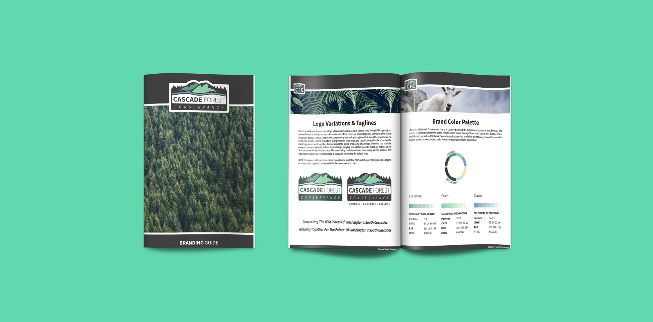
The main focus of this branding project was to provide a style that would be well suited for the new name, while still sticking closely to their mission and established look. Beyond that, SLTFNDRY was also tasked with crafting the brand rulebook, so that the Cascade Forest Conservancy could always look awesome. This project fell right in line with what we love to do most, setting a business or organization up for success by providing all the tools and assets they need.
Process
For this project, we explored a wide range of styles before landing on the look that eventually became the brand. We began the process with in depth research on who the organization is and what they do so that we could have a deep understanding of who we were working with. From there, we were able to take a look at the visual styles that had been used in the past. Research is a very important phase of the branding process. Once we had our footing, we were able to have multiple design and feedback sessions with the CFC, combining our visual design experience with their knowledge of their organization and target audience.

Challenges
With a wide range of supporters, the CFC wanted to make sure that the new brand would function as a bridge to bring people together and not alienate anyone. Even though this is generally true for any business, it’s especially relevant with such a diverse pool of donors, supporters, and volunteers. With this mission in mind, SLTFNDRY was tasked with creating something that would be the same, but different. Finding that balance between the familiar and the unknown looks different for each project, but it’s always a welcome and exciting challenge.
Key Features
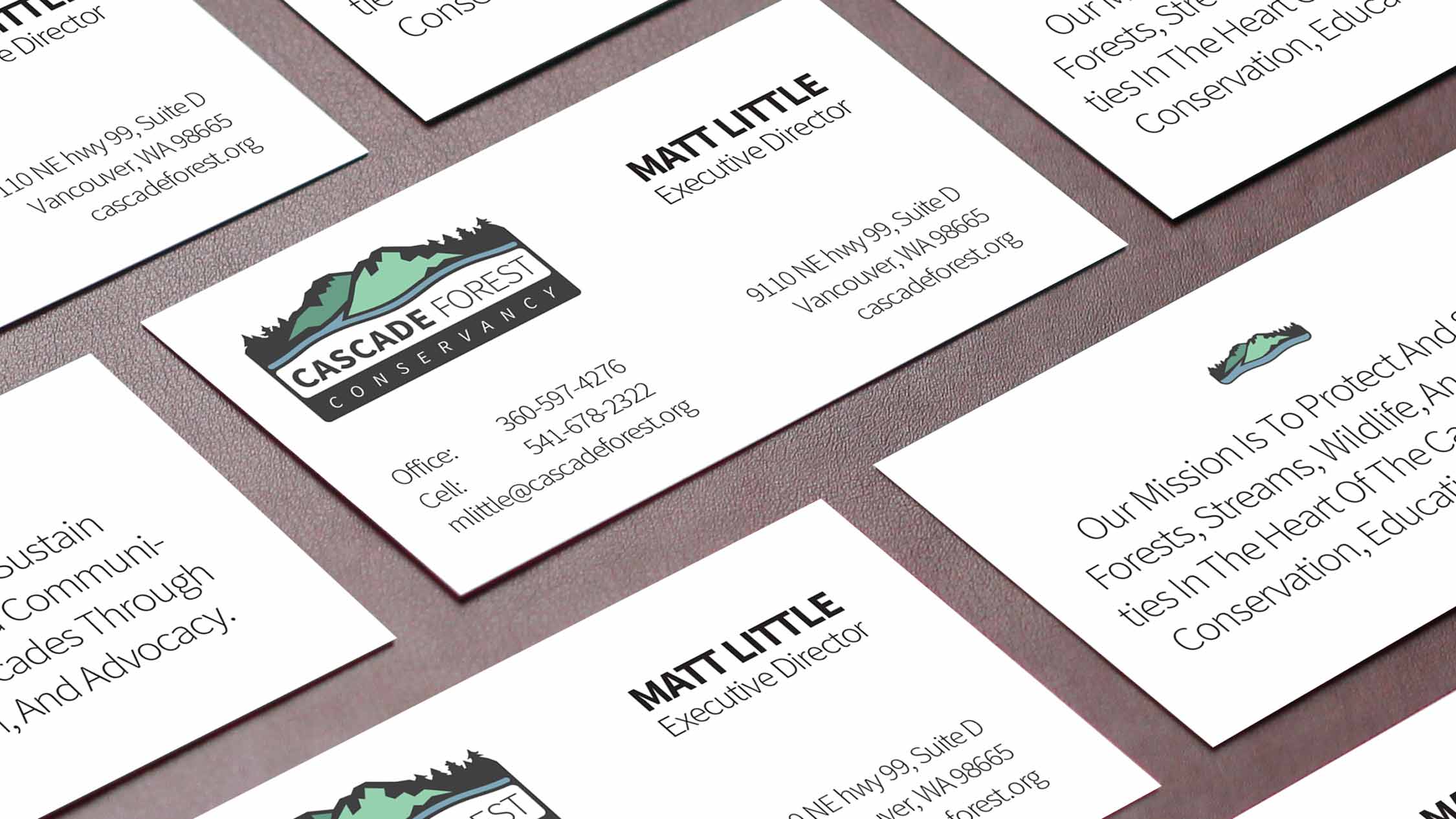
At it’s core, this brand focuses on the outdoors. From the start, we wanted to make sure that the new logo would be comfortable on a business card, as well as conceptually comfortable in the PNW. In order to accomplish this goal, we incorporated a color palette built of earth tones and soft forest shades. Adding to this, the logo and supporting icons bring in the boldness of the great outdoors. Finally, we established an imagery style that incorporates a strong use of outdoor photography.
Results
Working through this creative process was exciting for everyone involved, and we all had a great time exploring all the options for this brand. After all the decisions were made, we were able to provide the CFC with a new brand, a branding guide with the rules of how to use their files, various ready-to-print designs, and web design guidelines. Creating or updating a brand is much more than just a logo, and we wanted to make sure that the CFC had nothing to worry about moving forward.


